
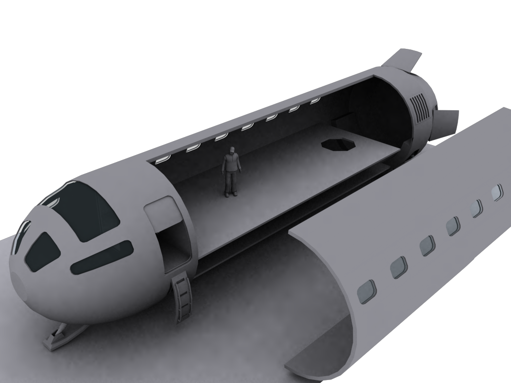
Howdy troops. Yeah, I'm still around, although the activity here wouldn't suggest that. In addition to learning the Mongoose Traveller rules, I've also been spending some time refining techniques and doing a lot of experimenting. Most of what I've come up with is far less than stellar, but it has taught me a few things (like how to get through life without using booleans and spending an hour cleaning up stray vertices). I've also been developing some methods for my current project, which is shown above. It's a classic 20 ton Launch for future use, with the twist that I'm working up full interiors as well as exteriors, similar to some of the stuff MagMagMag has done on COTI (such as THIS). Suffice to say, I have a new appreciation for the work he's done in this arena...it's tough, and requires more thought and decisions than I expected.
The number one thing I've discovered so far is that, with most ships, iris hatches are damn impractical. There just never seems to be enough clearance to make them feasible.
Cool in theory, but very difficult to implement. The standard cylindrical shape is also kind of a pain...it minimizes the amount of space required for a fitted hangar, but brings with it a boatload of issues as well. For instance, in the launch above, how do you allocate passenger vs cargo space? Where do you put the cargo hatches? How high are the decks? Where the hell can I put the landing gear?
The above design incorporates most of the good ideas that I've come across over the years...the landing gear, for instance, are similar to those used by Scarecrow on his version of the 100 ton scout. The upper deck is just shy of 2 meters in the center of the cabin, and the lower deck is 1.35 meters beneath to allow some usable deck area. Simply splitting the diameter in half didn't really work worth a damn, so this is a compromise. The major problem is, at least in this passenger configuration, you're not going to be hauling cargo containers. A cargo version with the ability to fit containers in winds up being able to carry about half as much cargo as you should, with lots and lots of wasted space. I may tackle that down the road.
One of the other issues that caused some headache was the personnel hatch...if it's that high off the ground, how the hell do you get up and down? That's where the folding ladder arrangement comes in.
Anyhow, that's enough for tonight. There's some other stuff in the pipeline, but I'm keeping that under my hat until I have some solid to post. Night all!
7 comments:
Very nice. Look forward to seeing more.
MagMagMag's biggest problem is his lighting. His models are beutiful and insanely detailed but they're usually spoiled by super-intense ray-trace shadow casting lights dotted all over the place that not only bleach areas out but also have multiple hard shadow lines conflicting with each other, breaking up the mesh lines and obscuring the model detail.
It's worth reading up on studio lighting setups (such as the three point) and how the lights work in your modelling package of choice to get the best results.
I'm really enjoying following this blog, btw.
Scarecrow
Oh, love the fold-out ladder and engine flaps btw. Nice ideas.
I agree...Mags stuff is excellent, but the lighting always bugged me, as well as the fact pretty much every surface is hard, clean, and shiney. Stuff gets dirty, and that can add a lot of character to a ship.
I'm honored that you're following my scribblings, Scarecrow - you're in large part responsible for me getting into this stuff.
So basically, I am the only one here who thinks his stuff is just fine the way it is. Ah well.
See for me, MagMagMag's stuff always represented the high interstellar TL end of Traveller. Not the scruffy PC average interstellar, but more like the top of the line IN and IISS stuff.
Also, I never had a problem with his lighting, in fact I rather like it. Looks all clean and nice.
Don't get me wrong...I love his work; it's been one of my major inspirations as well, along with Boulton and DeGraff. In every sense, it's beautiful work, it just doesn't fit my particular style. The same is true with pretty much all of the CG artists floating around. It's not so much a criticism as a difference of view.
Glad to see you here, Craig...I look forward to reading thru your blog.
I hear you. Frankly it is always nice to have another good CG Artist in the community.
Also I second the comments about the ladder and fins. Tre Chic!
Post a Comment